Overview:
In June 2020, at the height of a national reckoning around racial justice, I was approached by the Movement for Black Lives (M4BL) to lead the branding and design system for a historic reboot of the Black National Convention—originally held in 1972. It was a profound opportunity to contribute creatively to a cultural moment with deep political and emotional resonance.
I brought in my two partners from We Made It., and together we executed the project under my direction. As a “player/coach” Creative Director, I not only oversaw the full brand rollout but also contributed directly across disciplines—from copywriting and visual design to motion graphics and audioscapes.
Role:
Creative Director, Branding Lead
Creative Director, Branding Lead
Studio:
We Made It.
We Made It.
Timeline:
Summer–Fall 2020
Summer–Fall 2020
The Challenge:
How do you honor the legacy of the 1972 Black National Convention while creating a visual identity that reflects the complexity and vitality of Black life in America today?
How do you honor the legacy of the 1972 Black National Convention while creating a visual identity that reflects the complexity and vitality of Black life in America today?
The Goal:
A concept bold enough to hold space for history, yet flexible and modern enough to resonate across generations, media channels, and the full spectrum of Black identity.
A concept bold enough to hold space for history, yet flexible and modern enough to resonate across generations, media channels, and the full spectrum of Black identity.
Impact:
The 2020 Black National Convention became a digital-first event with national visibility and cultural impact. Our brand system helped:
• Elevate M4BL’s voice during a crucial election year
• Attract cross-generational engagement across digital platforms
• Create a visual and emotional throughline that united a wide coalition of speakers, artists, and activists
It remains one of the most meaningful branding projects of my career—proof that thoughtful design, when rooted in truth and collaboration, can rise to meet the moment.
The breakthrough came from a thought I had related to the reframing of color theory:
“White is the presence of all light on the spectrum. Black, in science, is the absence of light. But in practice—on an artist’s palette—mixing all pigments gives you Black.”
Creative Concept: Blackness Is Everything
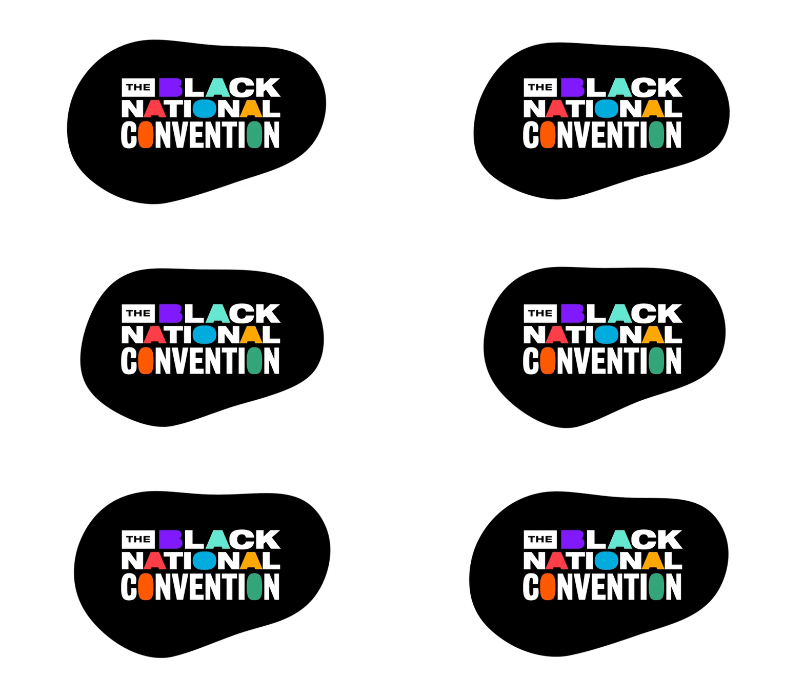
This became our guiding metaphor: Blackness is not a void; it is the blending of many cultural palettes. It’s expansive, vibrant, and layered. With this principle, we built a brand that embraced the richness and multiplicity of Black identity—politically, culturally, and aesthetically.
Execution:
Under my creative leadership, we developed and deployed a comprehensive branding system that unified the event across platforms, including:
• Social media campaigns and toolkit
• Email newsletter design
• Streaming broadcast visuals
• Event microsite
• Custom motion graphics and audio branding
• Merchandise and print collateral
• Email newsletter design
• Streaming broadcast visuals
• Event microsite
• Custom motion graphics and audio branding
• Merchandise and print collateral
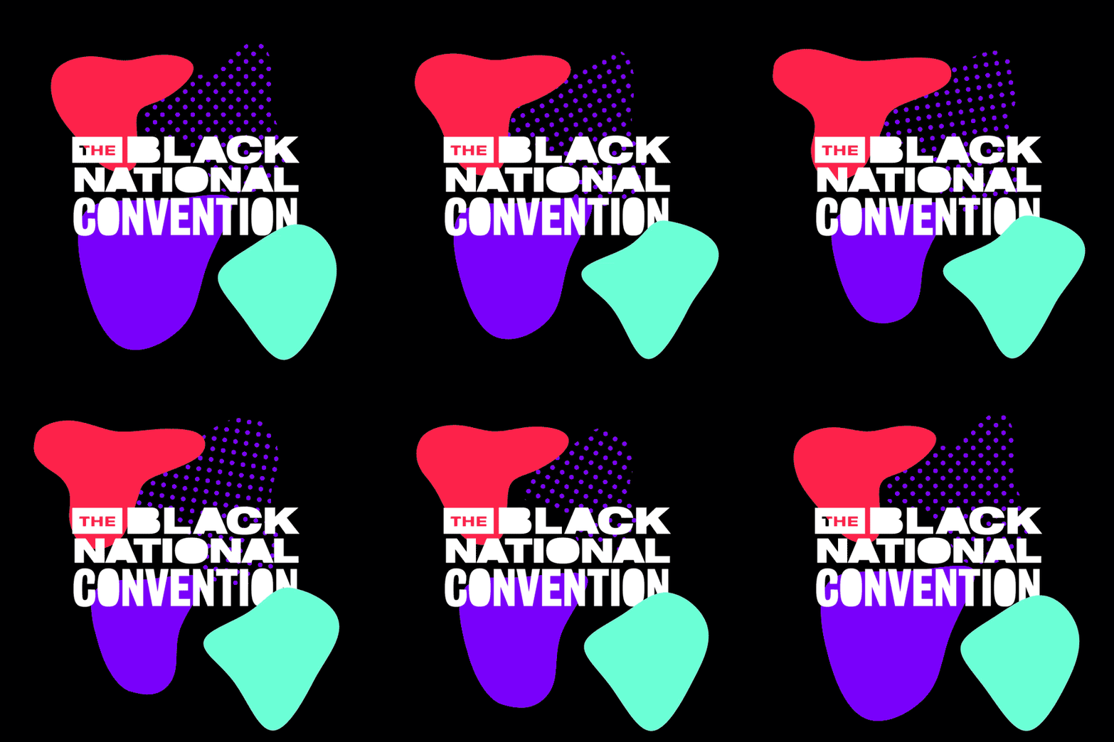
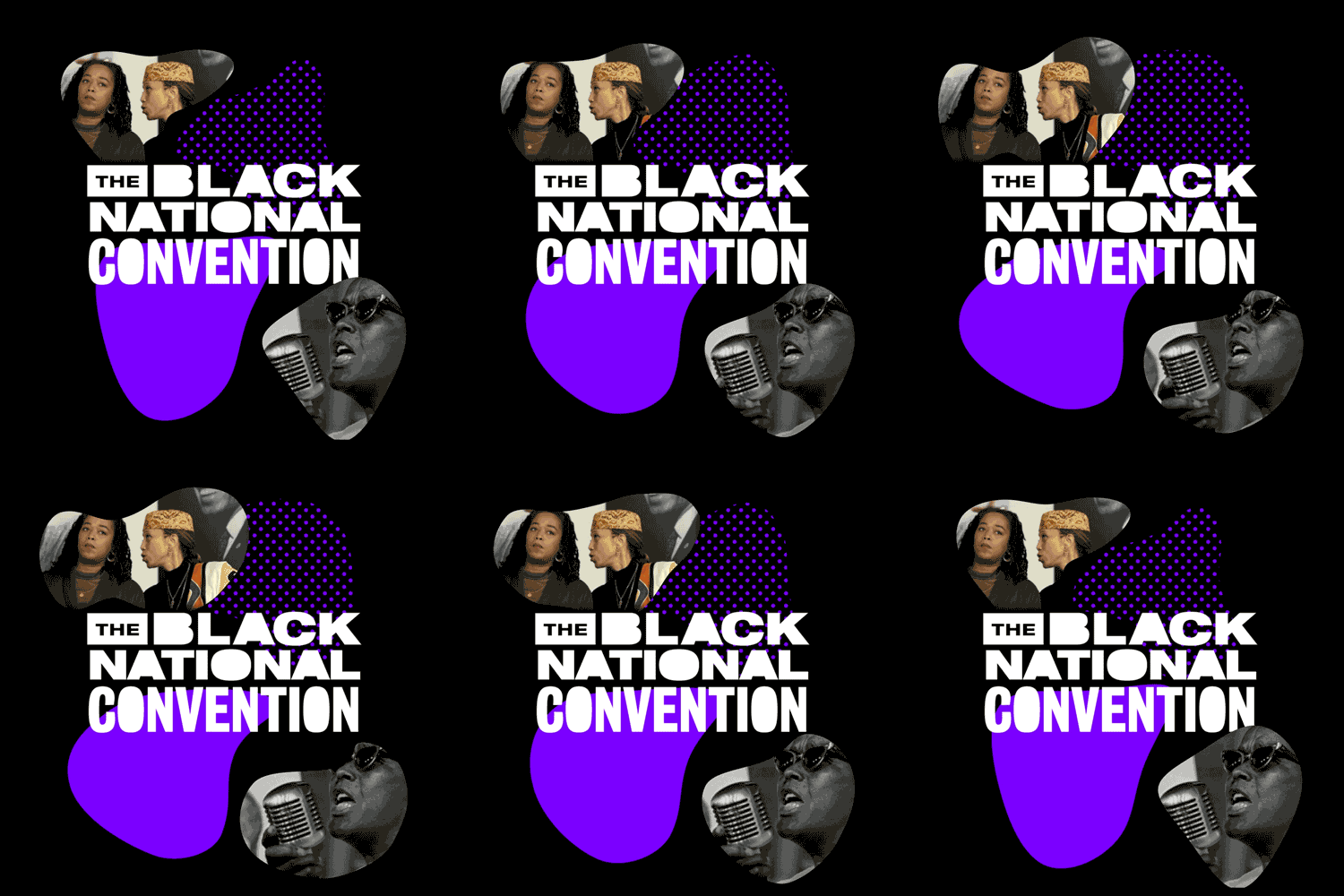
The visual language centered on bold typography, dynamic color blending, and texture-driven animation—creating a living, breathing brand that felt urgent, modern, and deeply rooted in legacy.

