Overview:
Flocabulary is a K–12 learning platform that uses educational hip-hop videos to engage students and support literacy across subjects. While the desktop product was well-established in classrooms, the company wanted to expand its reach to individual parents and students through a standalone native mobile app.
Flocabulary is a K–12 learning platform that uses educational hip-hop videos to engage students and support literacy across subjects. While the desktop product was well-established in classrooms, the company wanted to expand its reach to individual parents and students through a standalone native mobile app.
In collaboration with Buoy Development, I led the UX and product design for the mobile experience, translating Flocabulary’s rich content and playful brand into a seamless app for iOS and Android. Launched in 2017
Role:
Product Design Director
Product Design Director
Platform:
Native Mobile App (iOS & Android)
Native Mobile App (iOS & Android)
Timeline:
12 Weeks
The Challenge:
Flocabulary’s existing platform was designed for classroom use, with tools tailored for teachers and school subscriptions. A mobile app aimed at parents and students required a different approach — one focused on personal use, intuitive navigation, and fast content access.
Flocabulary’s existing platform was designed for classroom use, with tools tailored for teachers and school subscriptions. A mobile app aimed at parents and students required a different approach — one focused on personal use, intuitive navigation, and fast content access.
The Goal:
• Adapt the experience for individual users (not classrooms)
• Encourage engagement with free content to drive subscription upgrades
• Launch a functional MVP under an aggressive timeline
• Adapt the experience for individual users (not classrooms)
• Encourage engagement with free content to drive subscription upgrades
• Launch a functional MVP under an aggressive timeline
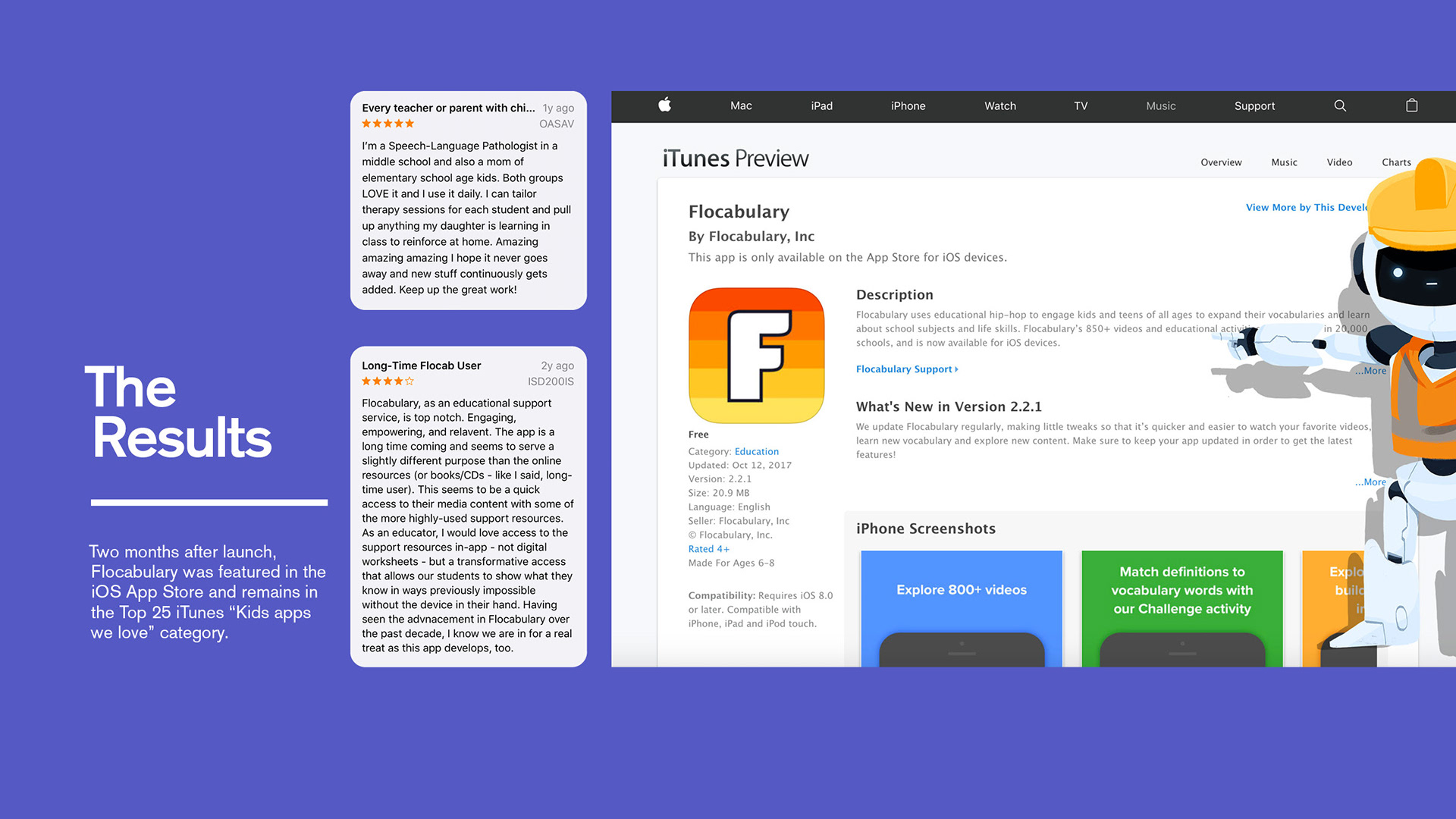
The Impact:
• Successfully launched MVP apps for **iOS and Android** on schedule
• App Store rating of **4.8 stars**
• Featured in the App Store and ranked Top 25 in iTunes’ "Kids Apps We Love" within 2 months of launching
• Successfully launched MVP apps for **iOS and Android** on schedule
• App Store rating of **4.8 stars**
• Featured in the App Store and ranked Top 25 in iTunes’ "Kids Apps We Love" within 2 months of launching
My Approach:
1. Research & Strategy
I conducted interviews with Flocabulary stakeholders, parents, and student users to understand their needs, motivations, and expectations. This helped define the core requirements of the mobile app and allowed us to prioritize features for the MVP.
1. Research & Strategy
I conducted interviews with Flocabulary stakeholders, parents, and student users to understand their needs, motivations, and expectations. This helped define the core requirements of the mobile app and allowed us to prioritize features for the MVP.


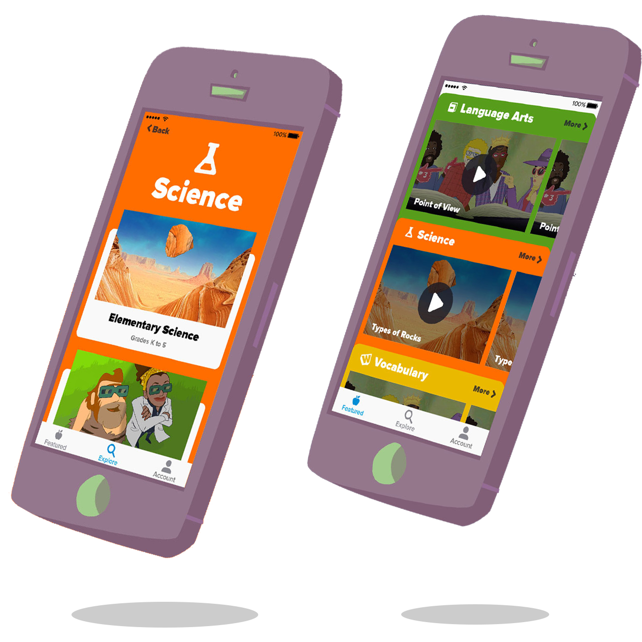
2. Designing for User Behavior
The research revealed two primary ways users expected to browse Flocabulary’s content:
• By subject area
• By grade level
The research revealed two primary ways users expected to browse Flocabulary’s content:
• By subject area
• By grade level
Knowing the business goal was to drive users into content quickly and convert them into paying subscribers, I designed two low-fidelity prototypes exploring these navigation patterns. We tested both with parent-child pairs to see which approach was more intuitive and engaging.
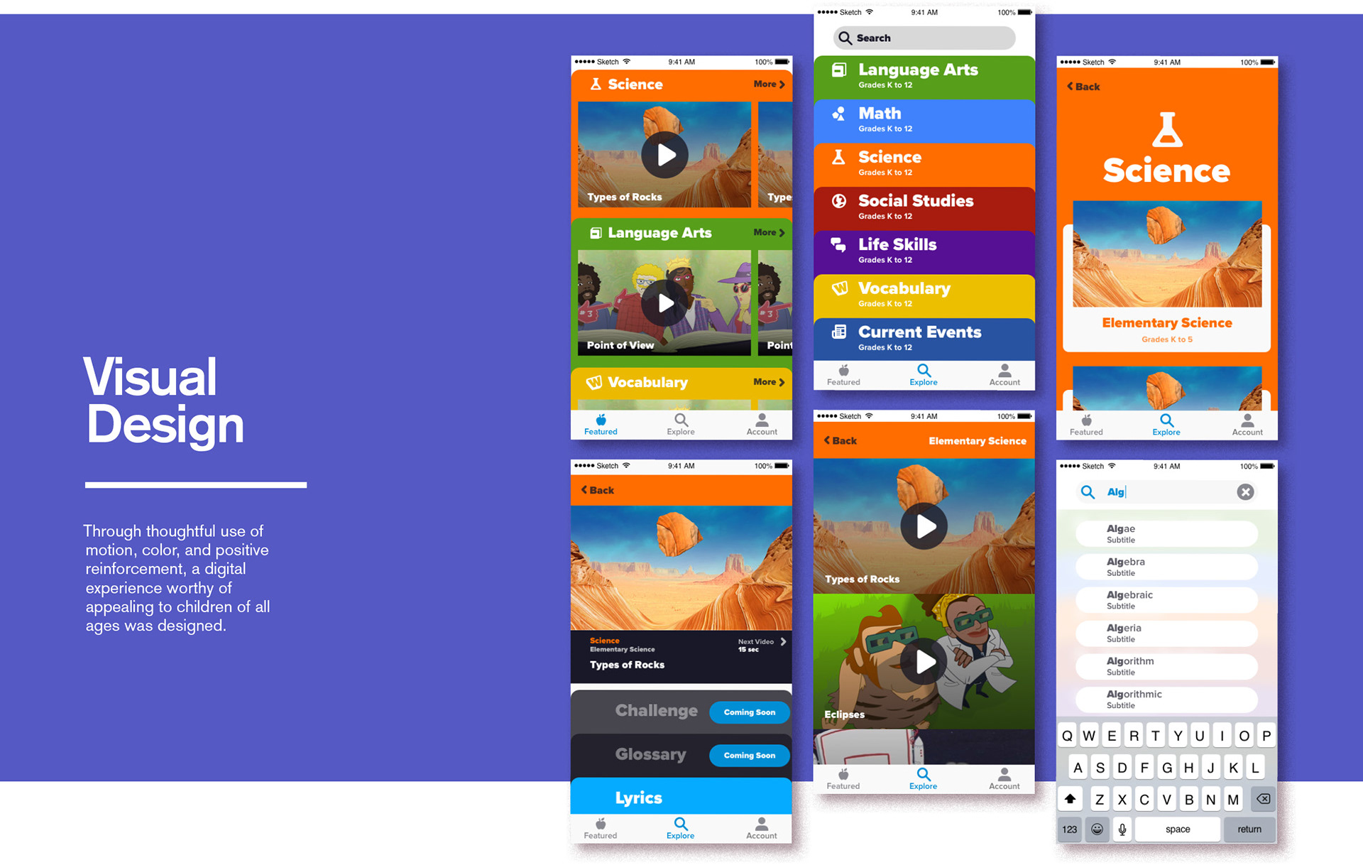
3. Visual Design & Systemization
After reviewing our A/B testing results with the Flocabulary team, we moved forward with the better-performing navigation model. I then translated Flocabulary’s web-based branding into a flexible mobile design system, ensuring consistency across iOS and Android while making the experience feel native to each platform.
After reviewing our A/B testing results with the Flocabulary team, we moved forward with the better-performing navigation model. I then translated Flocabulary’s web-based branding into a flexible mobile design system, ensuring consistency across iOS and Android while making the experience feel native to each platform.

Collaboration & Execution:
Throughout the design phase, I worked closely with Flocabulary and Buoy Development, sharing progress in weekly check-ins and refining designs based on feedback. This iterative approach allowed us to move quickly and stay aligned as we approached development.
Throughout the design phase, I worked closely with Flocabulary and Buoy Development, sharing progress in weekly check-ins and refining designs based on feedback. This iterative approach allowed us to move quickly and stay aligned as we approached development.
I provided all final design specs and collaborated with engineering to ensure a smooth handoff and build process. We worked in parallel across both platforms and managed the entire app store submission process to meet tight launch deadlines.

Reflection:
Designing Flocabulary’s mobile app required balancing fun, educational content with clear UX that guided users toward subscription. By grounding decisions in user behavior and close collaboration with stakeholders, we launched a product that delighted users and delivered on business goals — on time and under pressure.
Designing Flocabulary’s mobile app required balancing fun, educational content with clear UX that guided users toward subscription. By grounding decisions in user behavior and close collaboration with stakeholders, we launched a product that delighted users and delivered on business goals — on time and under pressure.