Overview:
Watson Living is an early-stage fintech startup partnering with rental property owners to reward residents for on-time rent payments, lease renewals, and other positive behaviors. Users earn cash-back rewards funded directly to a Watson-issued debit card.
Watson Living is an early-stage fintech startup partnering with rental property owners to reward residents for on-time rent payments, lease renewals, and other positive behaviors. Users earn cash-back rewards funded directly to a Watson-issued debit card.
Role:
Product Design Principal / Consultant
Product Design Principal / Consultant
Platform:
Native Mobile App (iOS & Android)
Native Mobile App (iOS & Android)
Timeline:
6 months
6 months
The Challenge:
Watson’s core users—residents of low-income housing—often skewed older and less tech-savvy than typical app users. During onboarding, many were hesitant to share sensitive information and confused by unfamiliar flows, which created high drop-off rates and low debit card applications.
Watson’s core users—residents of low-income housing—often skewed older and less tech-savvy than typical app users. During onboarding, many were hesitant to share sensitive information and confused by unfamiliar flows, which created high drop-off rates and low debit card applications.
The Goal:
Build trust through a simplified, transparent onboarding and debit card application experience — ultimately driving higher engagement and adoption.
Build trust through a simplified, transparent onboarding and debit card application experience — ultimately driving higher engagement and adoption.
The Impact:
• Onboarding time decreased by 72%
• User adoption improved by 44%
• Significant reduction in drop-off related to debit card application and onboarding confusion
• Onboarding time decreased by 72%
• User adoption improved by 44%
• Significant reduction in drop-off related to debit card application and onboarding confusion
My Approach:
1. User Research & Pain Point Discovery
I conducted interviews with current tenants and reviewed onboarding analytics. Two major issues emerged:
1. User Research & Pain Point Discovery
I conducted interviews with current tenants and reviewed onboarding analytics. Two major issues emerged:
• Users were redirected to a third-party banking site outside the app to apply for their Watson debit card.
• The flow requested sensitive personal data (e.g., full SSN) without clear context or reassurance.
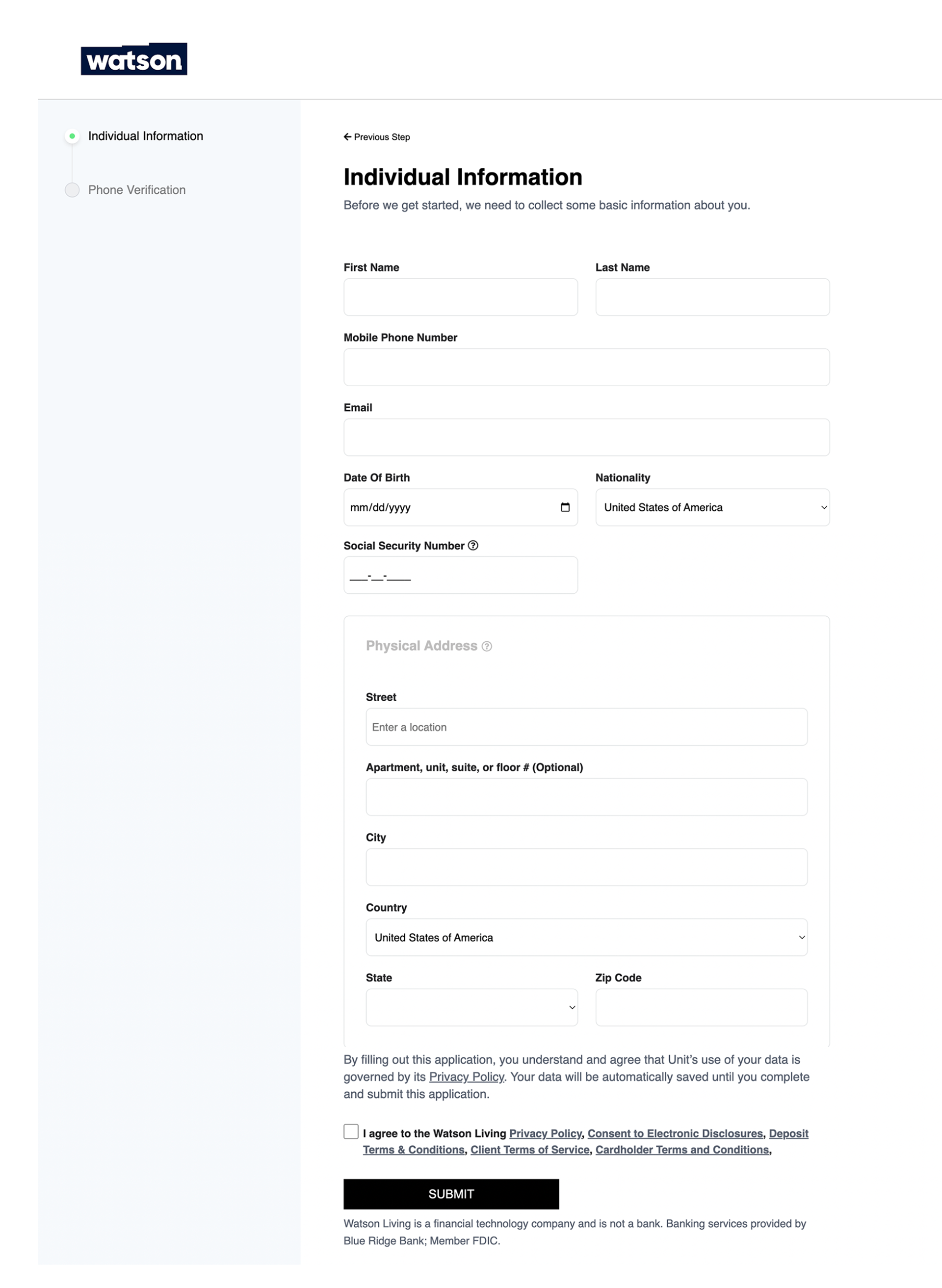
Before - 3rd party application page
2. Reframing the Onboarding Journey
To reduce cognitive load and user anxiety:
To reduce cognitive load and user anxiety:
• I decoupled the general onboarding from the debit card application.
• Proposed a two-step journey: first, app onboarding; then, debit card activation.
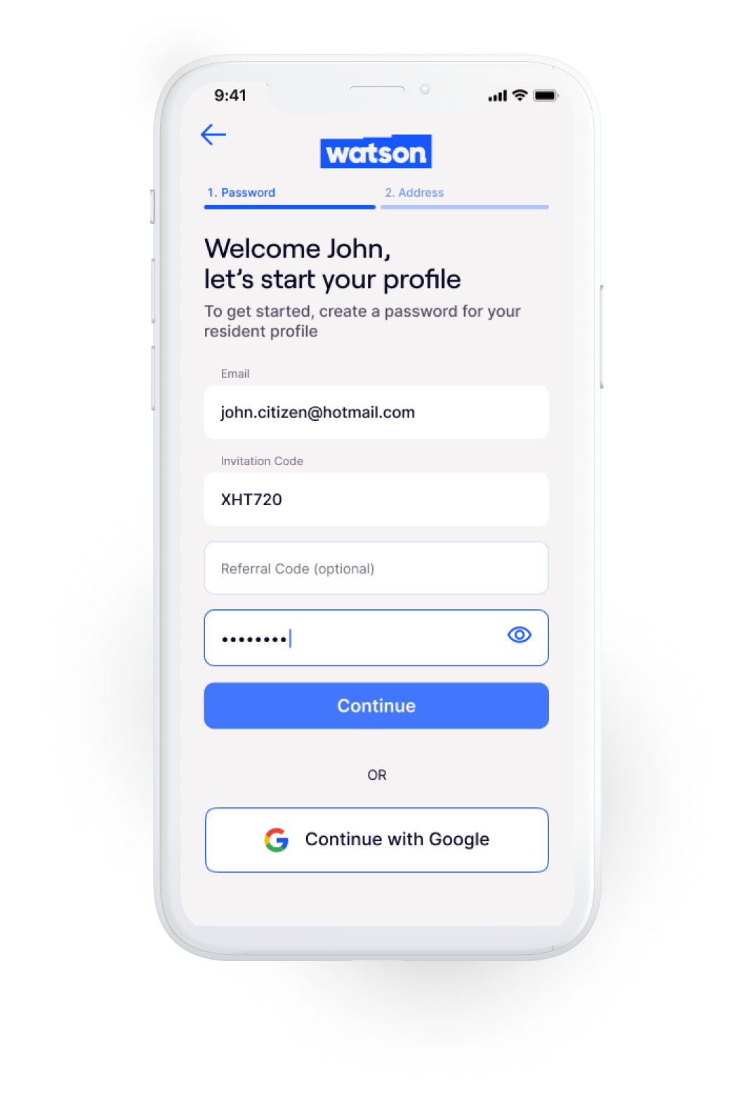
3. Leveraging Known User Data
Since Watson operates via partner property managers, we already had partial data on incoming users. I recommended using pre-filled fields tied to unique activation codes sent via SMS or email, reducing friction at sign-up.
Since Watson operates via partner property managers, we already had partial data on incoming users. I recommended using pre-filled fields tied to unique activation codes sent via SMS or email, reducing friction at sign-up.
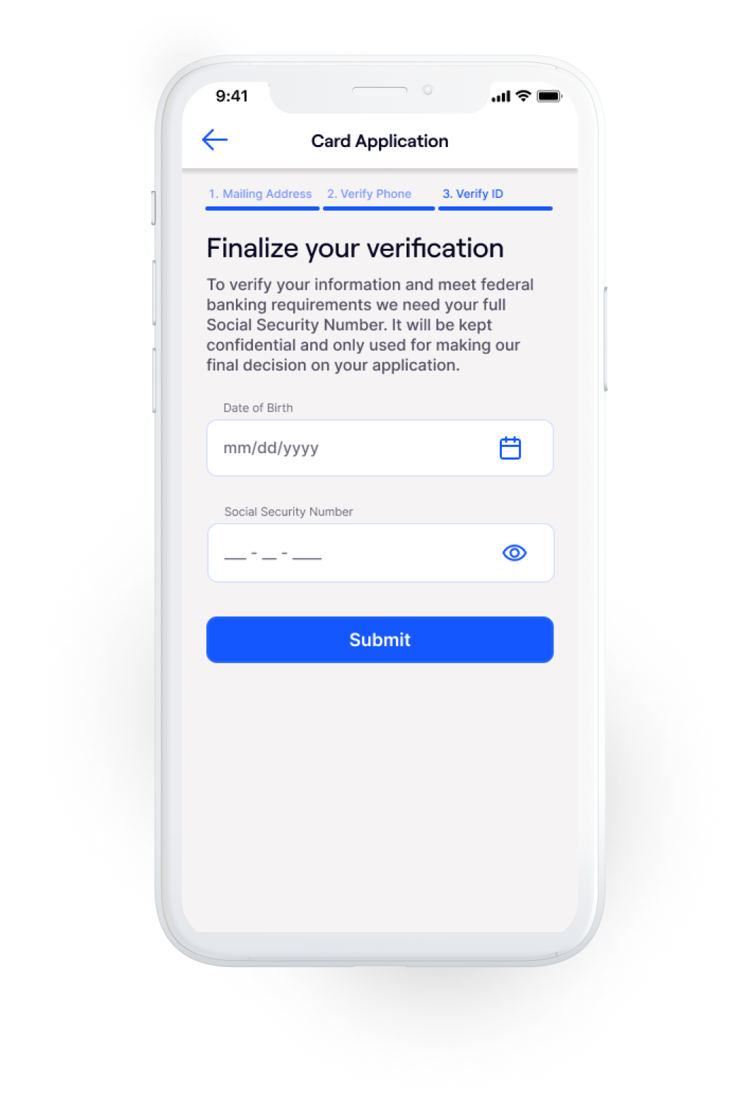
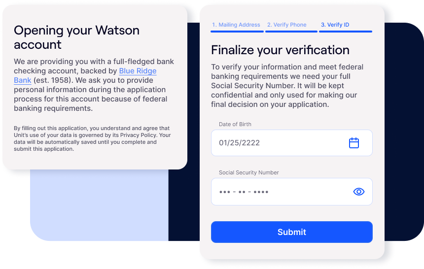
After - Account verification and debit card application are fully integrated into the native app
4. Enhancing Transparency & Trust
Clearly explained why personal information (like SSNs) was needed.
Clearly explained why personal information (like SSNs) was needed.
• Added a progress indicator to communicate where users were in the setup process.
• Created soft transitions between steps with simplified, friendly language.
Design Process:
• Created two onboarding flow options using clickable prototypes for A/B testing.
• Created two onboarding flow options using clickable prototypes for A/B testing.
• Tested both versions with real users, gathering qualitative feedback.
• One flow clearly outperformed the other in clarity and completion rate.
• Refined the winning prototype into high-fidelity, dev-ready designs in close collaboration with founders and engineering.
Clickable Prototype
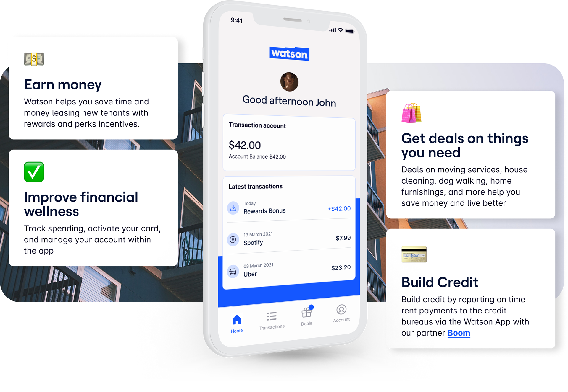
Key Features Delivered
• Seamless onboarding with pre-filled data and activation code integration
• Seamless onboarding with pre-filled data and activation code integration
• Debit card application with inline explanations and progress indicators
• Card activation feature post-physical delivery
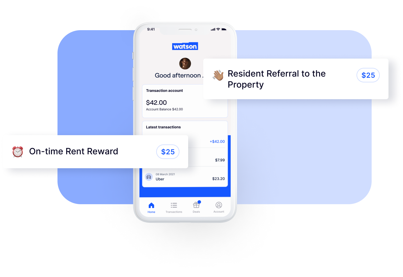
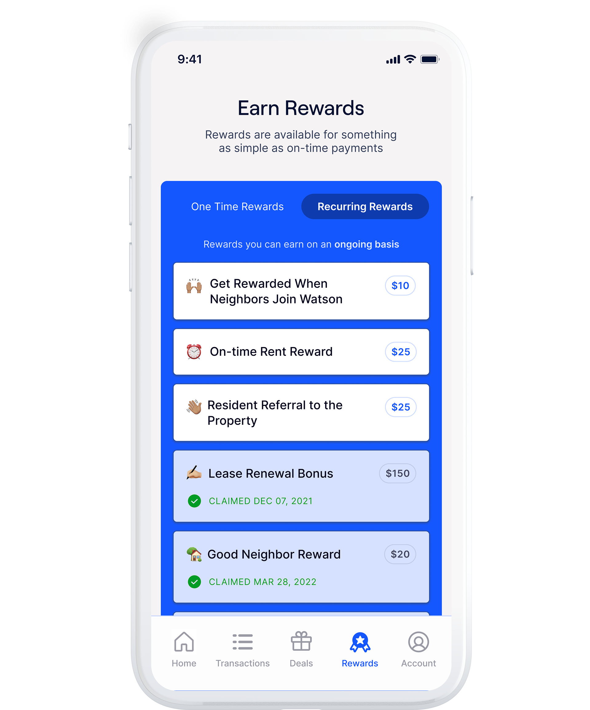
• In-app rewards dashboard
• Resident referral system
• Landlord dashboard
Reflection:
This project reinforced the importance of empathy and clarity in designing for underrepresented or less tech-savvy user groups. By meeting users where they are and providing transparent, simple flows, we were able to drive adoption and build trust in a sensitive financial product.
This project reinforced the importance of empathy and clarity in designing for underrepresented or less tech-savvy user groups. By meeting users where they are and providing transparent, simple flows, we were able to drive adoption and build trust in a sensitive financial product.
Property Manager Dashboard
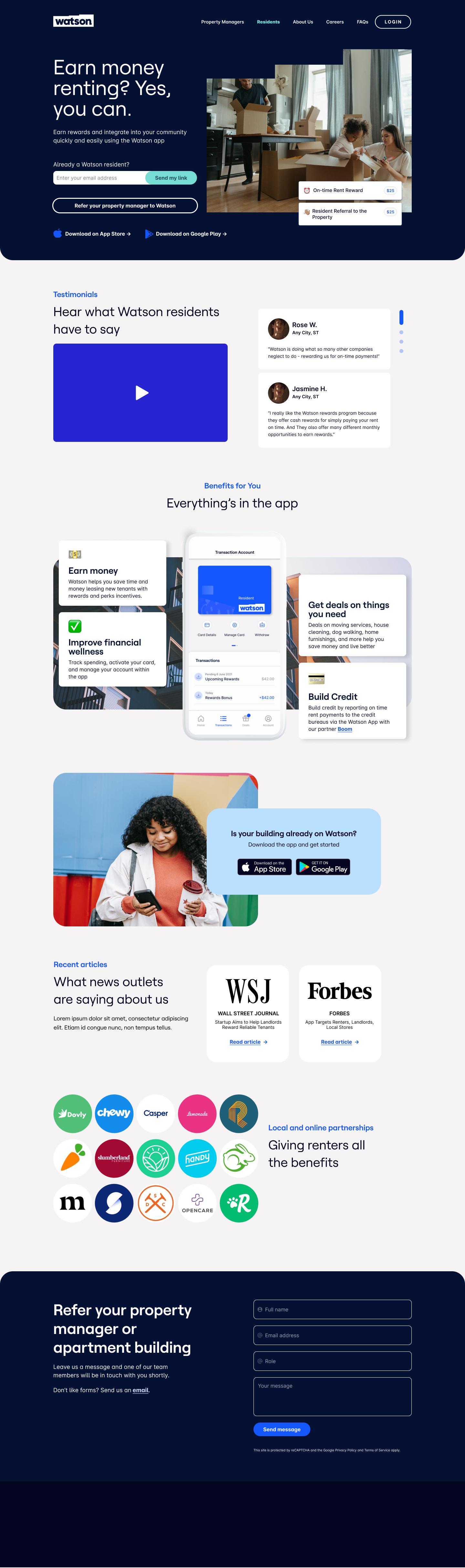
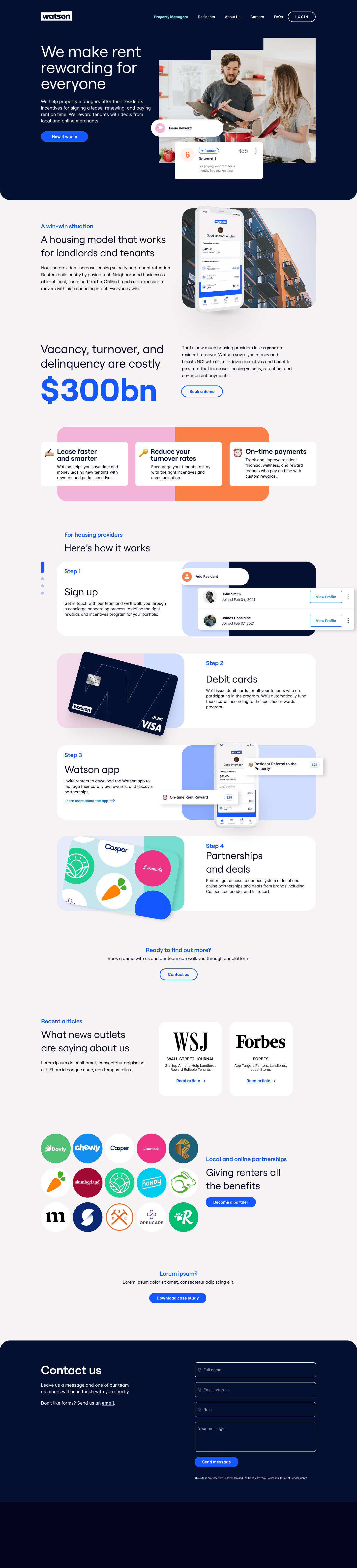
Website Redesign